Astra and Saya's Sig shop *Astra: Closed* *Saya: Open*
Moderator: Moderators
-
-Loveless-
- Posts: 773
- Joined: Sat Nov 11, 2006 4:25 pm
- Location: In Atoli's boobage. : D
- Contact:

-
Puppet of the Twilight
- Posts: 93
- Joined: Sun Jan 28, 2007 12:01 am
- Location: Inside of your soda

-
Puppet of the Twilight
- Posts: 93
- Joined: Sun Jan 28, 2007 12:01 am
- Location: Inside of your soda

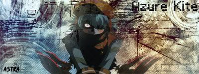
i agree with the colors, but i think the whole point of that azure kite pic is to look pixelized.Karma wrote:I like a light blue would've matched better than the red. The picture looks too edgy for me, and the characters look pixelized or magnified to much. But...overall, I think it's rather sleek.Puppet of the Twilight wrote:My latest one but I was lazy when I made this one so it came out a bit wierd
-
Puppet of the Twilight
- Posts: 93
- Joined: Sun Jan 28, 2007 12:01 am
- Location: Inside of your soda
the problem is when I used fillters or the pen tool it messed up the blending options so it turn out funny with the colors.Karma wrote:If that's the point, then the stained-glass look at the right of the signature should be pixeled, too. O__O But it's not, and neither is the Tri-edge on the left of the piece.Astra wrote:i agree with the colors, but i think the whole point of that azure kite pic is to look pixelized.Karma wrote:I like a light blue would've matched better than the red. The picture looks too edgy for me, and the characters look pixelized or magnified to much. But...overall, I think it's rather sleek.Puppet of the Twilight wrote:My latest one but I was lazy when I made this one so it came out a bit wierd
-
Puppet of the Twilight
- Posts: 93
- Joined: Sun Jan 28, 2007 12:01 am
- Location: Inside of your soda
My bad ^^; we all make mistakes.Karma wrote:Ahh, I see. I can understand the situation with "it messed up the blending options so it turn out funny with the colors" ordeal. ^ ^ That's fine. Lemme see more, okay?Puppet of the Twilight wrote:the problem is when I used fillters or the pen tool it messed up the blending options so it turn out funny with the colors.Karma wrote:If that's the point, then the stained-glass look at the right of the signature should be pixeled, too. O__O But it's not, and neither is the Tri-edge on the left of the piece.Astra wrote:i agree with the colors, but i think the whole point of that azure kite pic is to look pixelized.Karma wrote:I like a light blue would've matched better than the red. The picture looks too edgy for me, and the characters look pixelized or magnified to much. But...overall, I think it's rather sleek.Puppet of the Twilight wrote:My latest one but I was lazy when I made this one so it came out a bit wierd
how can it mess them up? my blending options have never messed up before...Karma wrote:Ahh, I see. I can understand the situation with "it messed up the blending options so it turn out funny with the colors" ordeal. ^ ^ That's fine. Lemme see more, okay?Puppet of the Twilight wrote:the problem is when I used fillters or the pen tool it messed up the blending options so it turn out funny with the colors.Karma wrote:If that's the point, then the stained-glass look at the right of the signature should be pixeled, too. O__O But it's not, and neither is the Tri-edge on the left of the piece.Astra wrote:i agree with the colors, but i think the whole point of that azure kite pic is to look pixelized.Karma wrote:I like a light blue would've matched better than the red. The picture looks too edgy for me, and the characters look pixelized or magnified to much. But...overall, I think it's rather sleek.Puppet of the Twilight wrote:My latest one but I was lazy when I made this one so it came out a bit wierd

-
Puppet of the Twilight
- Posts: 93
- Joined: Sun Jan 28, 2007 12:01 am
- Location: Inside of your soda
-
Puppet of the Twilight
- Posts: 93
- Joined: Sun Jan 28, 2007 12:01 am
- Location: Inside of your soda


-
The*true*Terror Of Death

- Posts: 952
- Joined: Sat May 05, 2007 1:26 pm
- Location: Delta Hidden Forbidden Azure Hall
- Contact: